Activity #26: CSS FLEX

programming
Apply CSS Flexbox on 5 pages (e.g., product layout, employee cards, student profiles, etc.)
Name your repository CSS_FLEX
Add documentation in the README.md file of your repository
Submit the GitHub repository link
Deadline: December 5 2024
- Product Layout (product_layout/index.html)
<title>Product Layout</title>
Product 1
Product 2
Product 3
Corresponding CSS (product_layout/style.css) .product-container { display: flex; justify-content: space-between; padding: 20px; }
.product-card { flex: 1; margin: 10px; padding: 20px; background-color: #f0f0f0; text-align: center; }
- Employee Cards (employee_cards/index.html)
<title>Employee Cards</title>
Employee 1
Employee 2
Employee 3
Corresponding CSS (employee_cards/style.css)
.employee-container { display: flex; justify-content: space-around; }
.employee-card { flex: 1; margin: 10px; padding: 20px; background-color: #c2e0c2; text-align: center; }
- Student Profiles (student_profiles/index.html)
<title>Student Profiles</title>
Student 1
Student 2
Student 3
Corresponding CSS (student_profiles/style.css)
.student-container { display: flex; justify-content: center; flex-wrap: wrap; }
.student-card { flex: 1 1 30%; /* Grow to fill space */ margin: 10px; padding: 20px; background-color: #e0c2c2; text-align: center; }
- Pricing Table(pricing_table/index.html)
<title>Pricing Table</title>
Basic
Standard
Premium
Corresponding CSS (pricing_table/style.css)
.pricing-container { display: flex; justify-content: space-around; }
.pricing-card { flex: 1; margin: 10px; padding: 20px; background-color: #c2d2e0; text-align: center; }
- Testimonials (testimonials/index.html)
<title>Testimonials</title>
Testimonial 1
Testimonial 2
Testimonial 3
Corresponding CSS (testimonials/style.css)
.testimonial-container { display: flex; justify-content: space-between; }
.testimonial-card { flex: 1; margin: 10px; padding: 20px; background-color: #e0c2e0; text-align: center; }
And the last
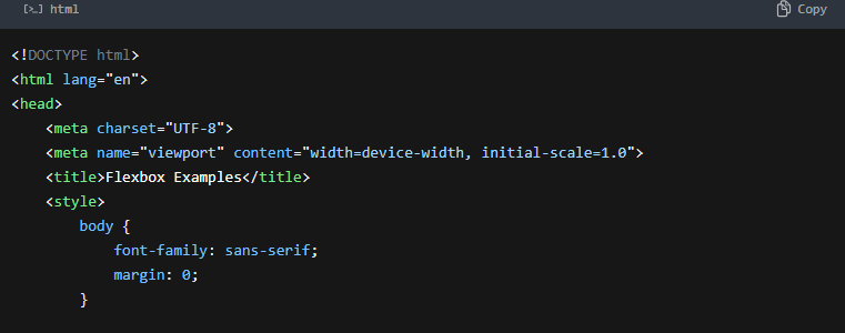
Open any of the index.html files in your browser to see the layouts. Technologies Used HTML CSS Flexbox
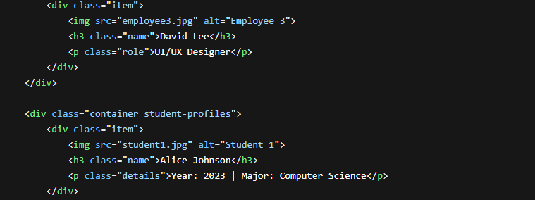
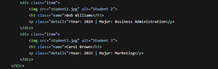
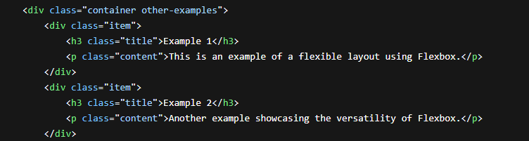
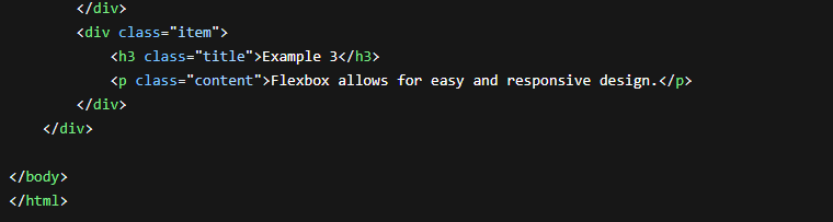
RESULT:
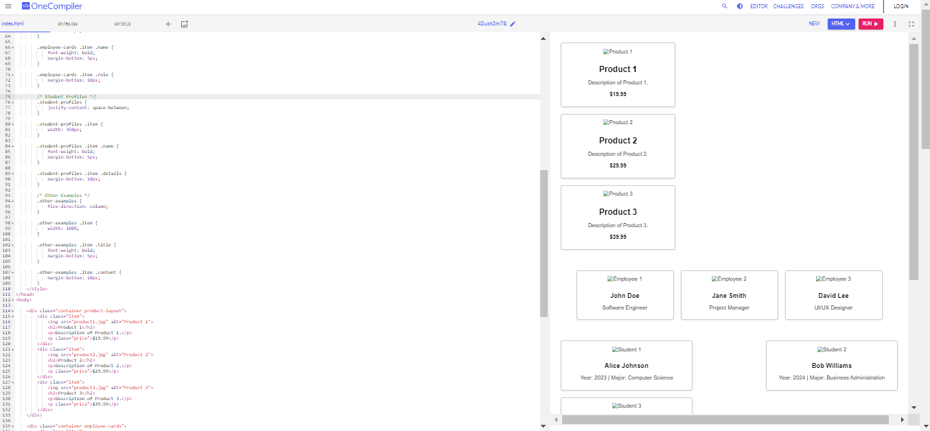
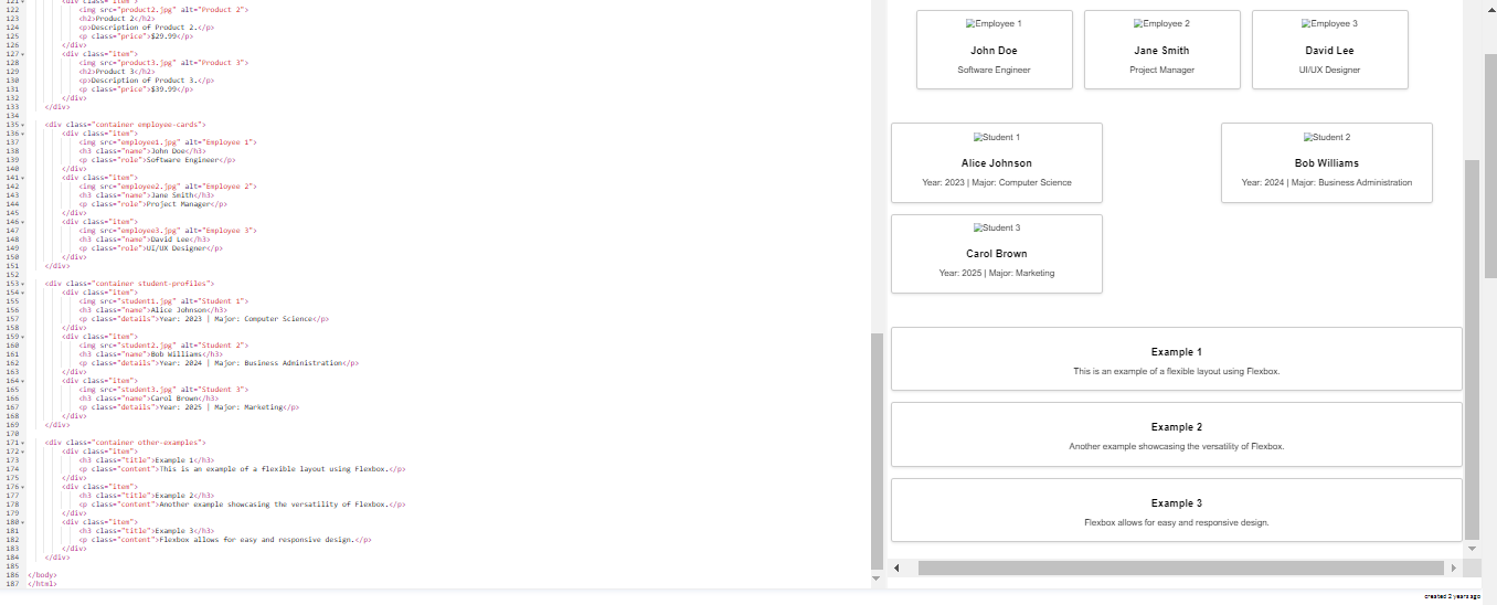
Explanation:
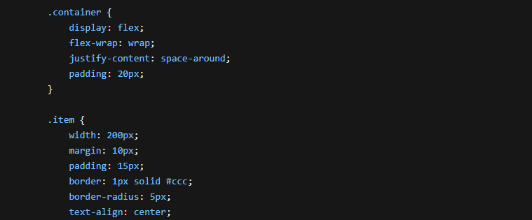
Basic Container Setup:
The .container class sets up the main Flexbox container.
display: flex enables Flexbox for this element.
flex-wrap: wrap allows items to wrap onto multiple lines if the container is too small.
justify-content: space-around distributes items with equal spacing around the container.
Item Styling:
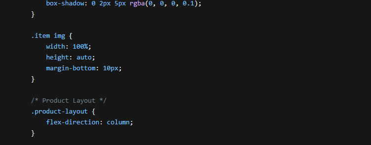
The .item class styles each individual item within the container.
width, margin, padding, border, border-radius, text-align, and box-shadow are used for basic styling.
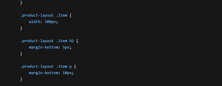
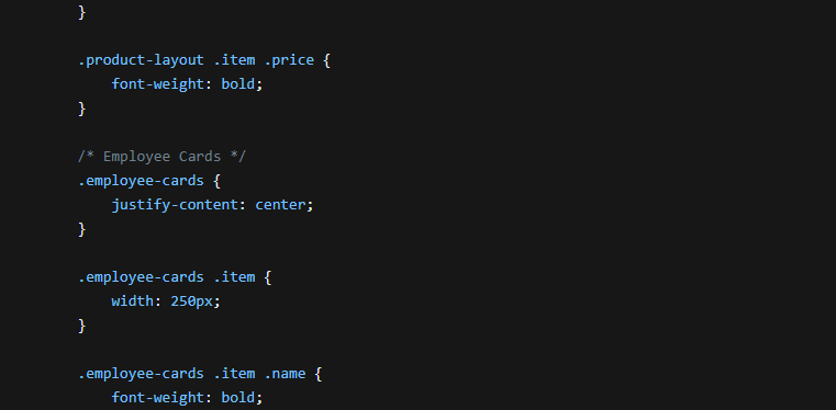
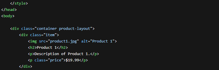
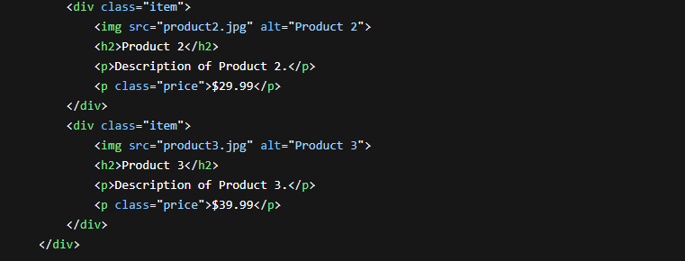
Product Layout:
.product-layout modifies the Flexbox direction to column to arrange items vertically.
Additional styling is applied to .item elements within this layout for product-specific presentation.
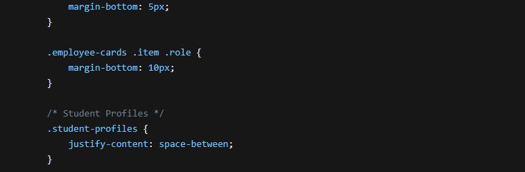
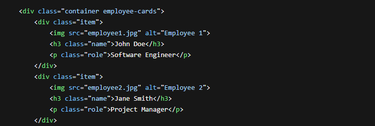
Employee Cards:
.employee-cards centers items horizontally using justify-content: center.
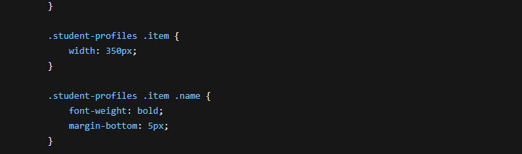
Student Profiles:
.student-profiles uses justify-content: space-between to distribute items evenly with space between them.
Styling for student profile elements is applied.
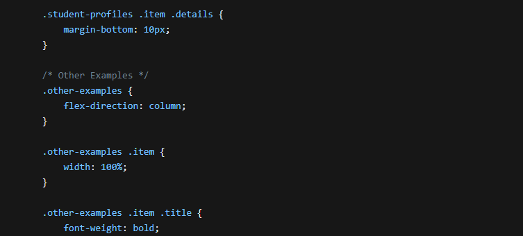
Other Examples:
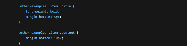
.other-examples demonstrates a vertical layout with full-width items using flex-direction: column and width: 100%.
Styling for these examples is adjusted accordingly.
Remember:
Replace placeholders like "product1.jpg", "employee1.jpg", etc., with actual image file paths.
Adjust CSS properties like
widthandmarginto achieve your desired layout and spacing.You can customize the styling further to match your specific design requirements.
This provides a basic framework for using Flexbox on different types of web pages. Feel free to experiment with different Flexbox properties and adjust the styling to achieve your desired layouts.
GITHUB LINK: https://github.com/MaricarRico/Activity-26-CSS_FLEX.git


